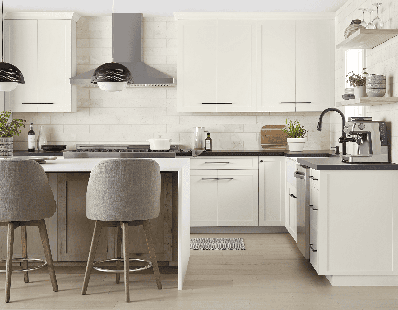
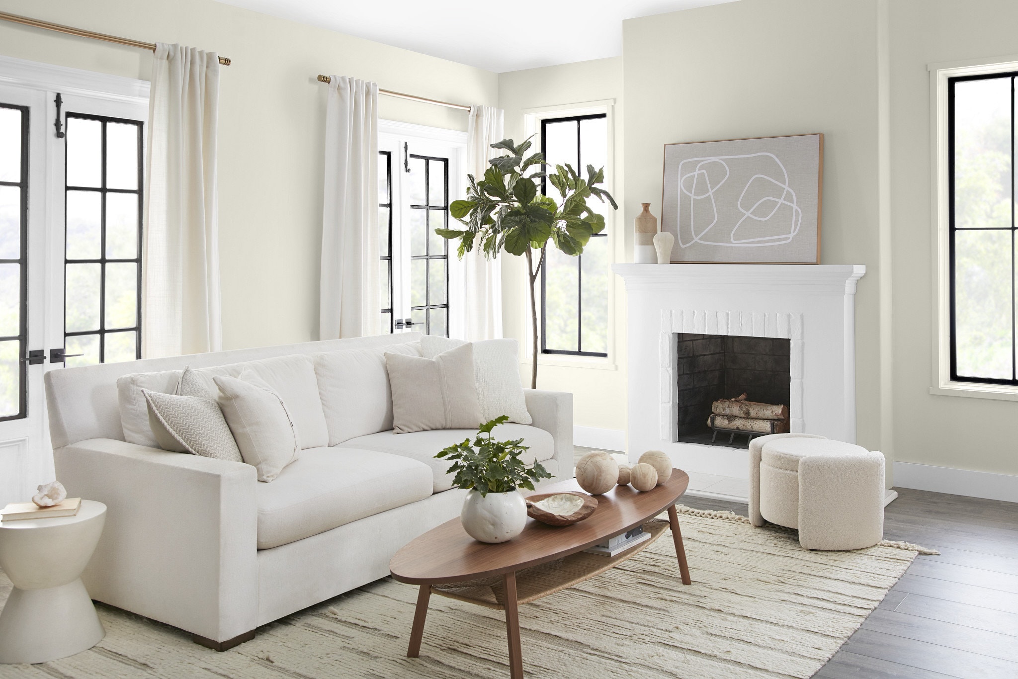
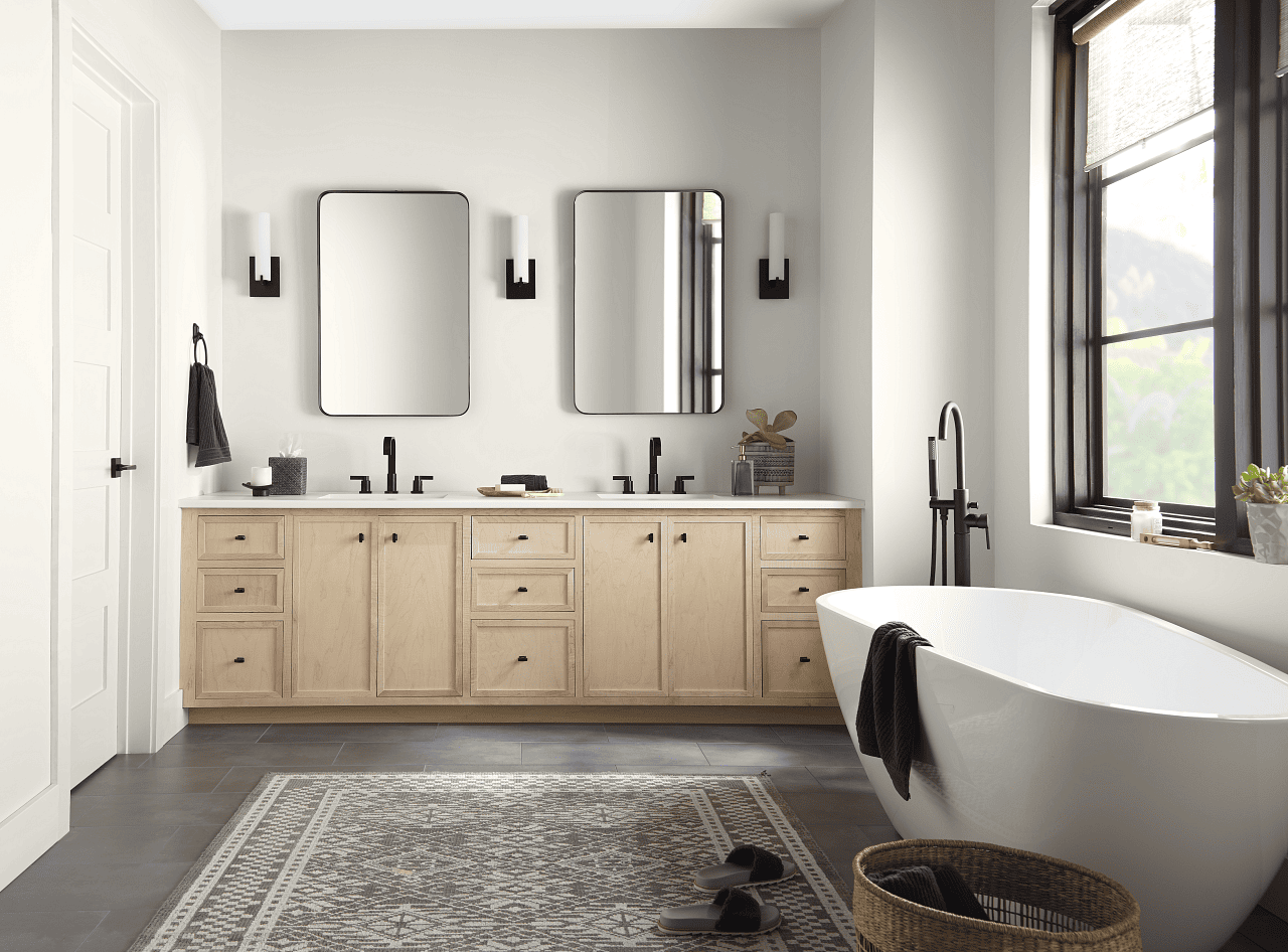
For the design crowd, fall colour viewing doesn’t mean going out to looking at foliage. Instead, it’s about waiting for manufacturers to name the paint colours they think will be a hit in the coming year. I can’t seem to keep up with all of it, and the season spreads itself out over a couple of months, but here’s what’s been announced so far:
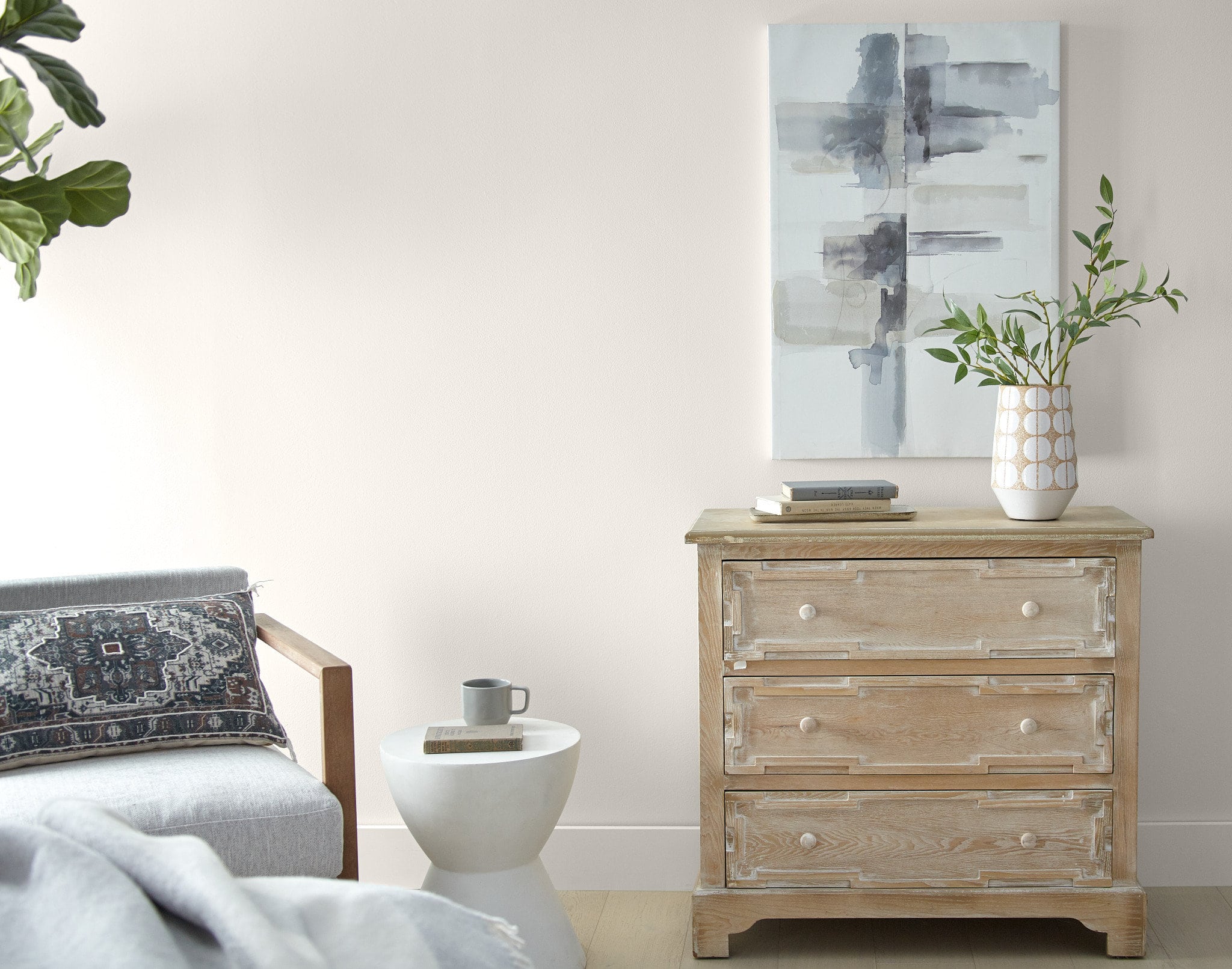
Behr—Blank Canvas
An easy-going, creamy white that harmonizes with other layered neutrals, textures, earth tones and pastels. It’s dramatic paired with black, blue, burgundy, and green; its buttery undertone makes it a lovely background for sunny oranges and yellows, as well as warm browns. Also effective on a gallery wall or open shelving.
Why white? Because design research from Behr showed that the colour—long a best-seller—makes 77 per cent of American homeowners feel positive. About three-quarters say it promotes relaxation and calm. Over 60 per cent say it’s a mood booster.
Below: Blank Canvas in design vignettes.


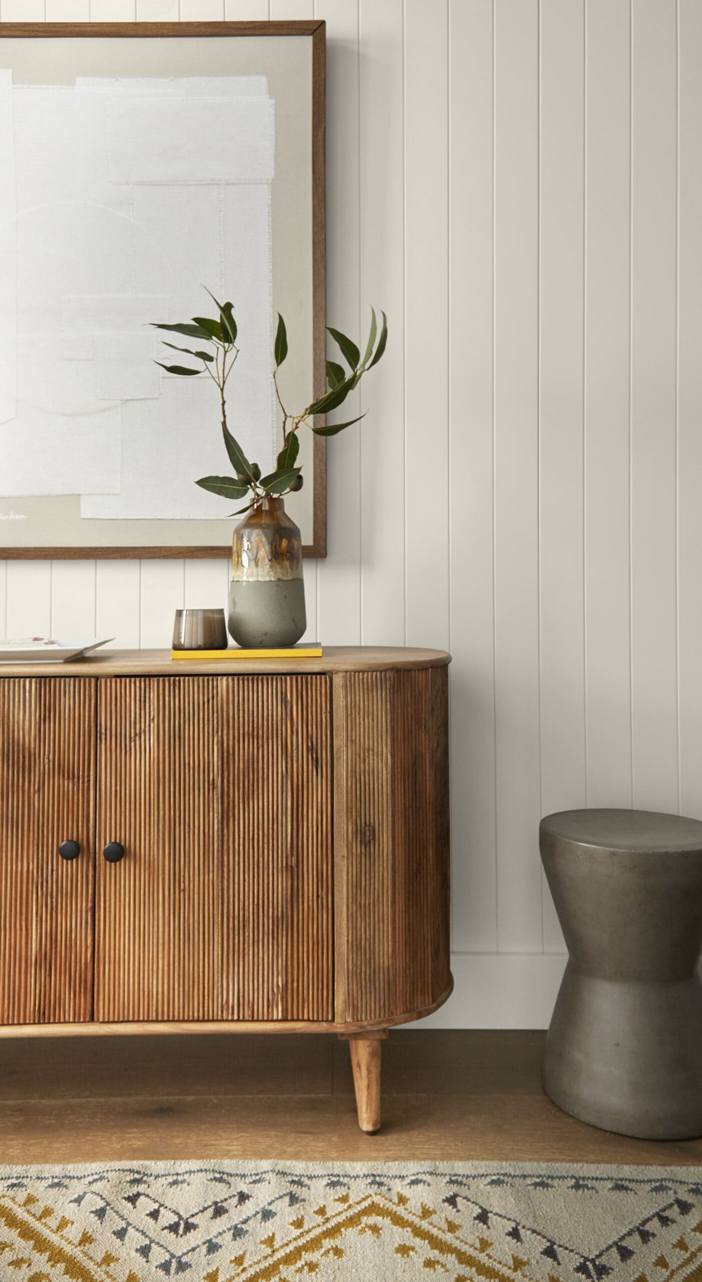
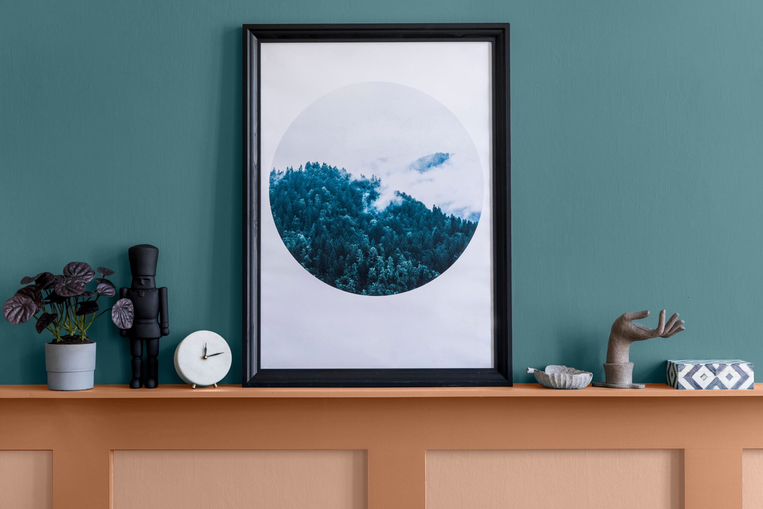
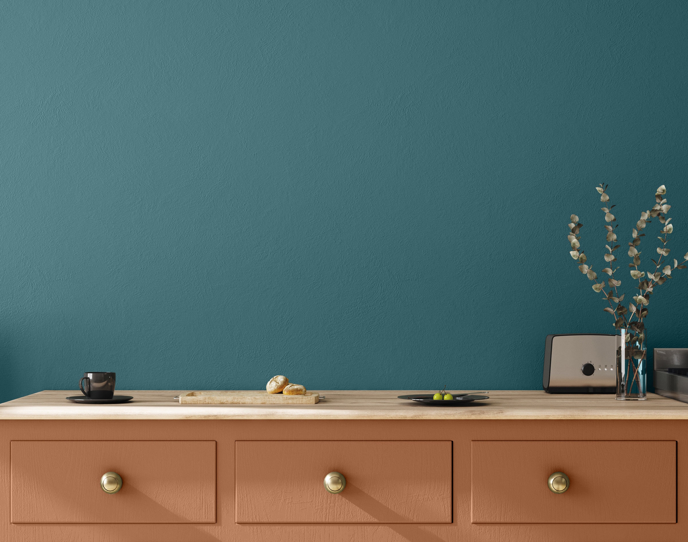
SICO—Melt Water
A refreshing, balanced teal inspired by the water’s tranquility and its power to heal and soothe. the SICO 2023 colour of the year can work with contemporary design, or add historical-influenced colour to traditional decor.
Some tips from SICO for using Melt Water (shown below)
- Paint it on all four walls, then pair with darker woods and off-white trim-my choice, probably
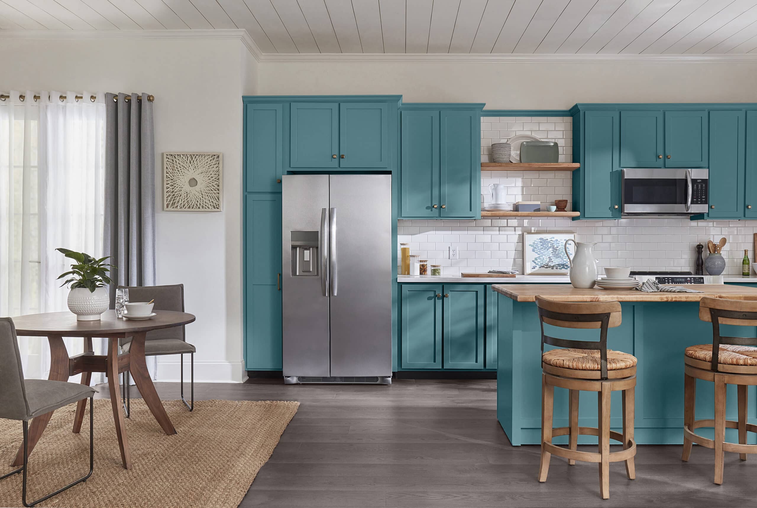
- Go glam: accessorize it gold accents and white trim-I’d go for matte black hardware
- Make a statement kitchen by using it on cabinetry and/or an island
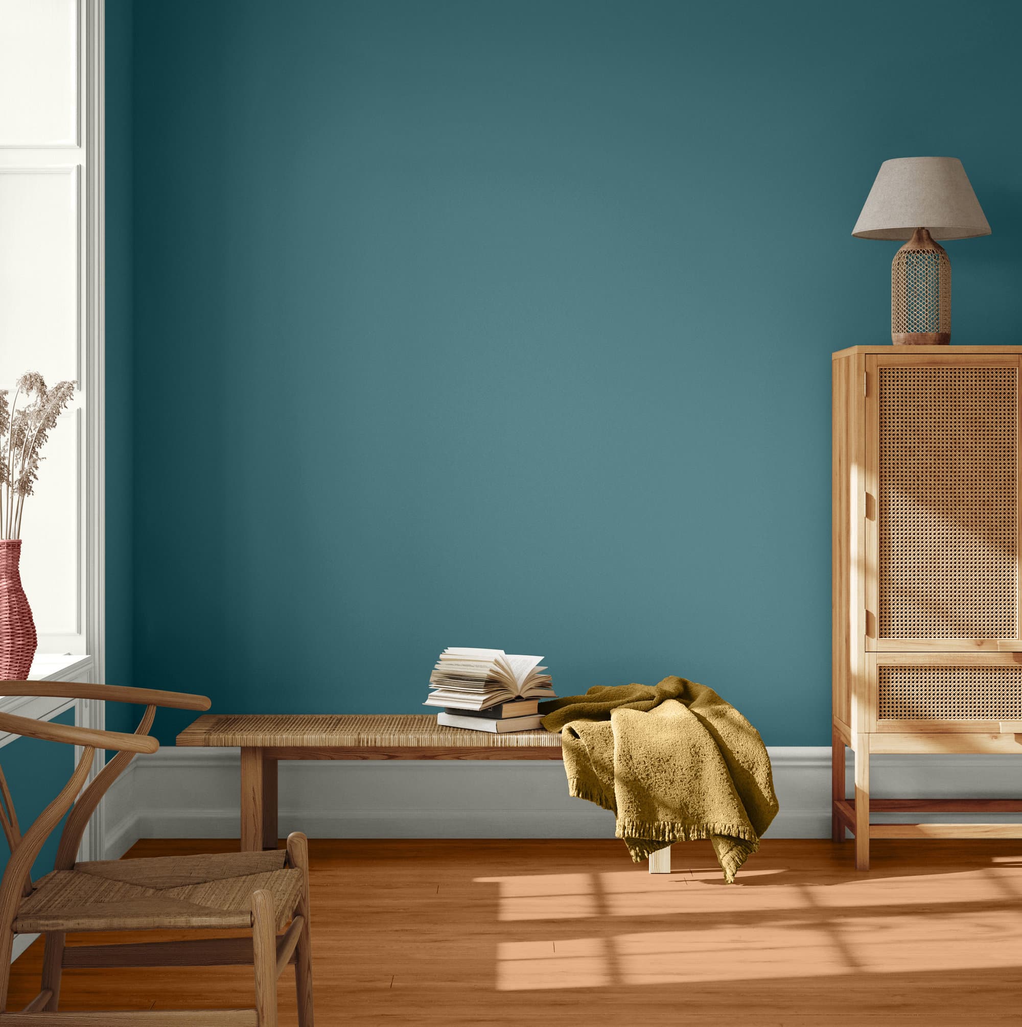
DULUX—Vining Ivy
Another blue-green (Sico and Dulux are both owned by PPG) that reflects the trend toward seafaring blues. Dulux suggests pairing it with earthen brown, clay, terracotta orange , and weathered neutrals
Sherwin Williams—Redend Point
This blush-beige neutral reflects the rise of terra cotta. Sue Wadden, director of Sherwin Williams color marketing, told Architectural Digest that It’s a colorful companion to cooler greys that can also stand on its own two feet.
“If you put it next to beige, Redend Point really looks like a color,” she says. “But on its own, you see that it really does act like a neutral, so it’s well-behaved.”
The choice grew guffaws from some designers—“it’s like a band-aid” or worse, “a hot-dog!” Some may settle down when they see a very similar colour used to great effect in the home of Mara Brock Akil and Salim Akil on the September cover of Elle Décor, which also has tips on using Redend Point as a design element. The colour on the cover, which is lovely, is Portofino from Portola Paints.
Next Up: Benjamin Moore announces its colour of the year for 2023 on October 12. In the meantime, BeautiTone put out such pretty pictures for its choice that it got its own slideshow.