
Tamara Robbins Griffith (TRG) has been giving me reliably good décor advice for more than a decade now. If you ever watched her on CityLIne, you can probably say the same thing. She’s a fount of knowledge, and she’s always happy to share.
Most recently, she didn’t disappoint when I asked her how to refresh a chair I love and use every single day.
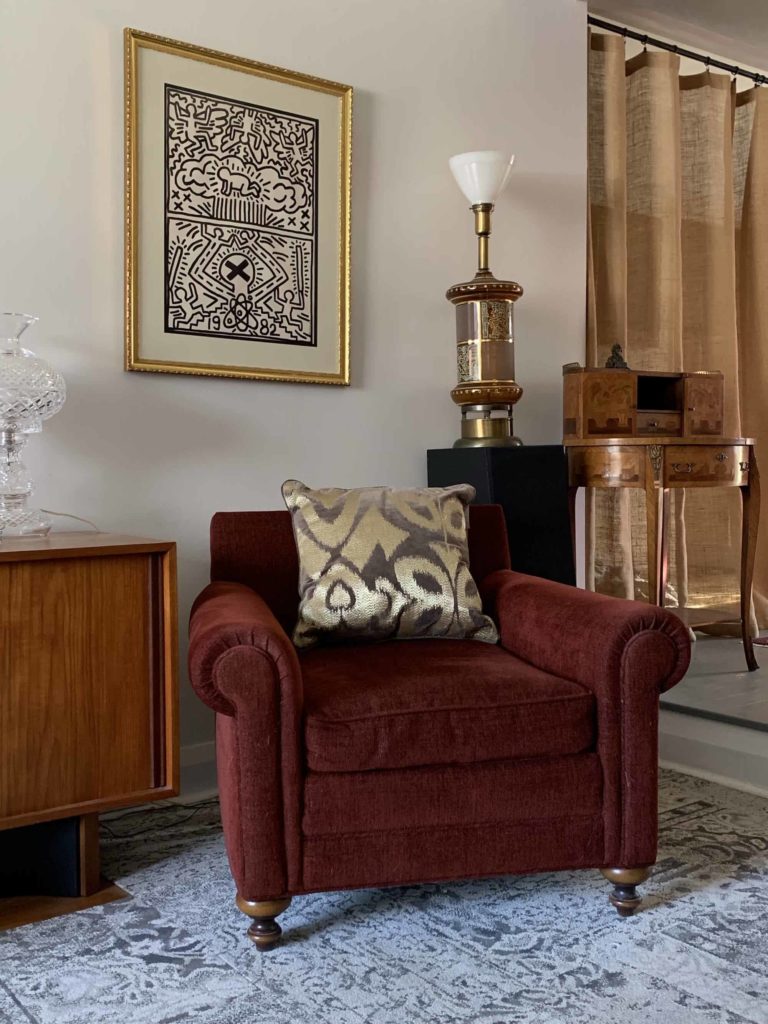
Found on the sale floor at Barrymore’s showroom 15 years ago, I loved the colour and the comfort of it, and still do. The Man of the House (MOTH) loves the big rolled arms and the deep seat. And with its ottoman, it’s perfectly sized for me to nap in. It’s given me tremendously good value.
Maybe one day I’ll have it recovered, the arms made slimmer, or the feet changed. But probably not, if I’m honest. It’s chair enough for MOTH and me, and doesn’t seem worth the expenditure of resources, frankly.
But during a recent visit to the showroom for HomeSense, where TRG heads up the media and design department, I confessed I wasn’t averse to a tweak.
TRG suggested that pillows might be my first, easiest, and most affordable line of defence.
How to choose? Look at the room colours obviously, she says, but also think about which colours and images I’d recently found engaging or interesting.

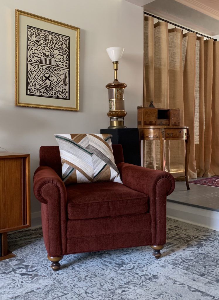
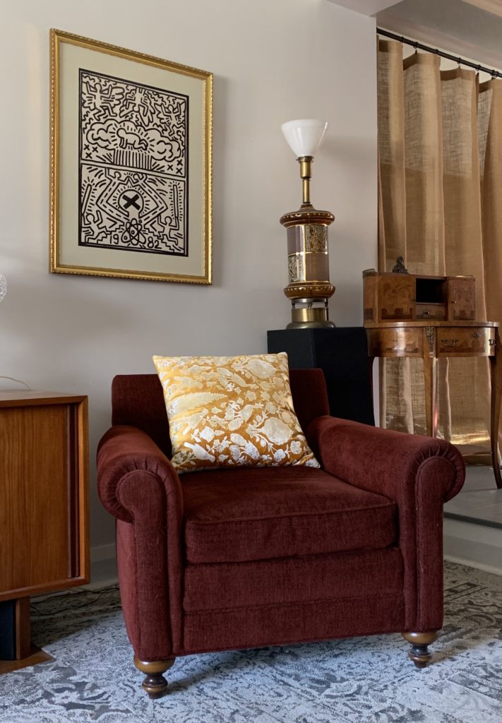
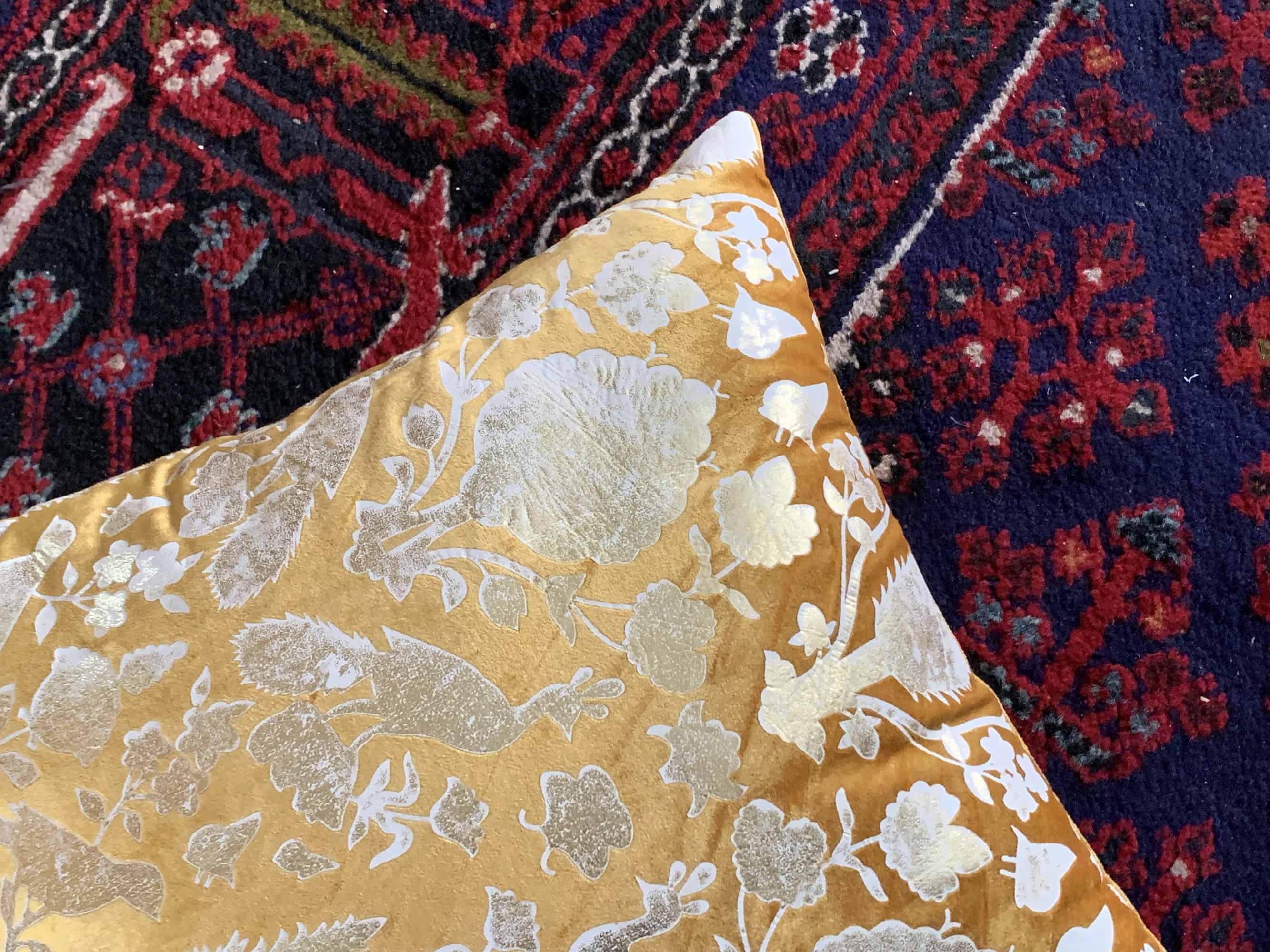
It was a great tip. I have found myself looking at darker pinks and reds, warm golds, and bottle and fir greens. Also find myself mesmerized by the grey, black and brown of winter woods.
Touring the showroom, we grabbed a big pile of cushions I liked.
Taking pillows home to try on was another great pointer from TRG. Naturally that’s easier if you shop at retailers with good return policies, such as HomeSense. It’s also easier to judge colour, size, and comfort when the pillows are used on the furniture they’re intended for.
If you do, though, here’s a plea: keep the tags on until you’re 100 per cent sure you’re keeping the pillow. Store them in the bags they came in (with receipts) to make it easy to run back to the store, where they can be resold faster, which will reduce waste.
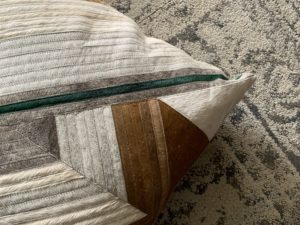
At home, I found that taking the chubby back pillow off the chair reduced its bulk. Replacing it with a well-sized pillow refreshed the corner and still delivered comfort. Here’s my pillow talk/tour.
NOTE: HomeSense loaned me the pillows for the pictures (I promise I will return them!), but did not review this article.