I’ve missed out on a lot of travelling over last year. Maybe that’s why I spent so much time looking at Emma Hayes wallpapers, which are inspired by New Zealand’s cinematic landscape—soaring mountains, glacial blue lakes, verdant rainforest, and long stretches of golden beach.
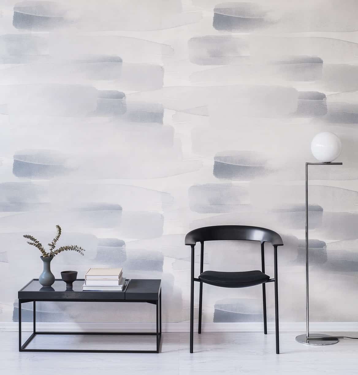
Her Tussock paper, for example, was rooted in vacation pictures she took of native meadow grasses moving in the breeze. Highly fluid, organic patterns based on pressed leaves, petals, the weathered erosion of sediment, wild grasses, shifting tides, cloud-dappled skies, rain, and lazy rivers all figure in Hayes’ work, often executed in strong, gestural brushstrokes.

All designs start with “some sort of mark making,” she says.
“There’s lot of watercolours, quick drawing, sketches from there patterns evolve. Sometimes it’s right away from the drawing, or you have thoughts in your head that sit for a while and percolate.”
The work is scaled large, a feature that reflects a love of post-war abstract expressionists like Mark Rothko, who were “thinking about the wall as canvas, making paintings to journey through. I like that it will go from the floor to the ceiling and perhaps around the room.”
Inspiration closer to home came from New Zealand artist Colin McCahon (1919 –1987) and his Northland Panels series; eight paintings the artist completed in 1958 after a U.S. tour during which he looked deeply at abstract expressionists such as Pollock, Rothko, and de Kooning.
Like these artists, Hayes explores the expressive value of colour, deftly employing subtle, desaturated tones —ash and mist greys, tea and honeyed browns, soft sage greens, along with mauves, pinks, and blues of varying weights. On some papers, like Cloud, there’s just enough shine, says Hayes, “to give it a lift, a bit of luminosity.”
“I like water colour to layer up and build colour and intensity,” she says, “and I like colour that transitions from dark to light.”
Hayes’ gold, black, and silver metallics also reference natural forms, like light shimmering on water, in a way she likes to think of as “harmonious”. She appreciates what reflective elements can do for fabrics, especially when they move. “I like thinking about those qualities and how it might enhance the design.”
Hayes’ career began as a graphic artist before she moved into fashion, where she says her love of textile and print came together. “But the time frame’s so short—you put so much work in and then six months later, it’s last season. With my interior work, I really enjoy working on designs with longevity. And once I started doing my own work, I could explore whatever I want,” she says.”
Combining hand-made prints with digital printing adds technical challenges that require specific manufacturing expertise. “There is a lot of technical thought that goes into it. You need a knowledge of ink and surfaces — it’s a craft,” she says.