When Alistair McAuley and Paul Simmons graduated in 1988 from the Glasgow School of Art, the prevailing design aesthetic was, according to McAuley, “beige and grey and minimal”. Personally attracted to saturated colours and complex textures, and fascinated by both classic historical designs and the slightly psychedelic patterns they grew up with in the 1970’s, McAuley and Simmons suspected that people “were getting scunnered (fed up) with minimalism, of places that looked fantastic until you put a person in them”. So they stuck to a singular vision, learning along the way every aspect of the business of print design and manufacture — sometimes through trial and error. What emerged was Timorous Beasties — now one of the most distinctive design houses of its generation. Read their impressive CV here.
Around the House recently sat down with McAuley, who was in town to promote the launch of Timorous Beasties’ fabric line through NewWall House, the (gorgeous) downtown studio of the wallpaper distribution company Maria Racco launched in 2009. Here’s some of that conversation.
AroundtheHouse: Being so drawn to ornamentation, historical patterns, and decorative elements must have made you outliers when you started.
Alistair McAuley: We trained for printed textiles, and were determined to stay on that path. We wanted to do our own thing in spite of the market. We liked historical details and working for weeks – maybe months — on a pattern.
ATH: Did that take a lot of confidence? Or a really clear vision?
AM: Confidence? Better substitute arrogance. Being straight out of college, we were full of it. And we could not actually do anything else. We thought within two years’ time we’d be okay. We started just printing surfaces — concrete paving slabs, glass, wood, roller shutters — anything flat that could have an image printed on to it.
Even then, people liked the (printed wallpaper designs). They just never loved it enough to buy it. Which is not great when you’re trying to set up a business. We had no knowledge of running a business. Certainly not one to do with manufacturing. You don’t get taught things like that at art school.
You have to learn everything. You are not just designers anymore – you do invoices and deliveries, answer the phone, balance books, cry on your knees to the bank manager. You get okay at lots of that. But if you’re still trying to be creative, it’s hard. A decade later, it started coming together. Now we have people do a lot of that. We’re probably horrible bosses – because we think we did it all ourselves before we had computers.
ATH: What prompted the decision to self-produce, and how has it helped — or hindered — your practice?
AM: The only way to market was to produce ourselves. There was no digital fabric. You couldn’t just print up two metres. It had to be a silk screen or a rotary screen and the investment is huge. The cunning plan was to do it ourselves. We realized that it cost £10,000 pounds to put one fabric into production, but that £10,000 will actually get a print table and some screens.
ATH: Can you talk about the different manufacturing techniques you now use?
AM: About five per cent of our work is still hand-printed. We have two hand-print tables and they are busy all day, every day. The rest is digital or rotary-screened. The digital process has been absolutely fantastic. It has allowed us to be far more experimental, to invest in designs that won’t sell a lot, but are important for the company to show. We can produce three metres and put it on the website. You can (fill an order) without having to invest in 12 screens at £600 a screen before you’ve even done a metre of fabric. That’s £6,000 before it’s gone to market. And if I doesn’t sell, I’ve lost £6,000.
ATH: How have you seen the appetite for ornamentation and pattern change, or vary in terms of demographics and geography?
AM: You will always have Danish design, American design, whatever — either geography or demographics will separate us from one another. What we have noticed over the years is that people have a broader understanding of design. It’s not dictated by a handful of shops with a handful of things. They have a better grasp of materials, they understand value. But (there’s also been) some homogenization. Ikea was great for design but meant that everybody had the same thing, whether they were in Glasgow or Iran. Now people want something that they identify with. There’s a confidence now about wanting to be more individual.
ATH: Robbie Burn’s poem To a Mouse, whom he calls a “tim’rous beastie” includes a lament that man’s dominion “has broken nature’s social union”. How does the notion of universal connection inform your design?
 AM: Well, we did not call ourselves that because of the poem. You’ve just cleverly shoe-horned that in there. We chose it because it vaguely sounded Scottish and did not tell you what we did. We did not know what we would be doing — fabrics, wallpapers. But to try and answer your question — the natural world is infinite. The multiplicity, the variation always presents itself to you in a different way. It constantly changes, constantly evolves and will constantly give us a reference. You can look at the same thing (in nature) many times and see it in a different way. Sometimes it only informs the next piece of work. You’ll use it maybe five, ten years down the line. We still bring out drawings we did at college, and think about how we might develop them.
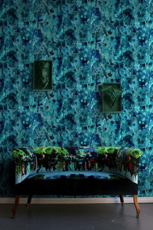
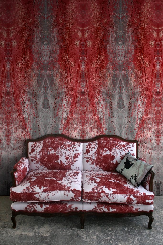
ATH: Timorous Beasties has played with toiles and damask, Chinoiserie, and classic florals. It strikes me that your reinventions show a respect, but not a blind reverence, for classic design.
AM: These are all things that we studied at some point. The basic ideas are interesting and beautiful. To copy them would fall into that 1980 trap of just copying archived works. You want to find out what made that particular pattern amazing. With toiles, it was that they depicted real social issues — wars, commemorative stuff — it all actually happened. Then the Victorians got a hold of it. There was no longer murder or civil war or rape – it was all chic, tidy dogs gamboling through the hills and women with fluffy hair. We took the guts of them and made them more contemporary. When we chose to depict Glasgow, there was criticism that we showed goths and junkies and cheap housing. But they existed, right outside our studio.
ATH: What was the response to the toile series?
AM: These were toiles for people who would not ordinarily buy a toile. We did have people bring stuff back when they actually noticed what was on it. One woman custom-ordered a paper called Bloody Hell for her child’s nursery. It had soldiers, blood, guns, the whole bit. How she thought something called Bloody Hell was remotely appropriate for a child’s bedroom takes some imagination.
ATH: Many people love the slightly hallucinogenic nature of your designs, and say that they evoke responses similar to that of being in nature.
AM: There’s no hallucinogens involved — not anymore. It’s easy to get inspired by the composition of a tree or a flower. Because we do this for ourselves and don’t have a panel of people telling us to make things more commercial, we can indulge — make it more interesting and dynamic and gutsy.
ATH: Your textile line includes a floral that bears the name of 19th century art critic John Ruskin, whom you hold in high esteem.
AM: A few years ago we were invited by Museums Sheffield They wanted to encourage people to use the sadly under-used Ruskin collection for research purposes. We spent three days going through the archives. Utterly amazing — so expansive and so detailed — and it had never been published before. We eventually got around to doing something with it. Random Ruskin (wallpaper) looks quite delicate but when you get it on the wall the flowers can appear in sometimes almost awkward places. I kind of like that — it plays on the wealth and unpredictability of nature.
ATH: You said in an interview with Houseology that it’s actually exciting if a project involves lots of restrictions.
AM: Being a designer, you are there to solve a problem. So when a client comes to you and says, “Oh just do whatever, it’s completely open,” well, It’s never open. The problem is, say, we can only use black, or it has to cost this amount of money, or have a certain time frame. If you have a restriction, your way of getting from A to B will be more creative.
We covered a building with aluminium leaves for a project. The client loved the idea, but we had to work with the façade engineers to make sure they did not fall off on anybody, which is a reasonable thing to request. It was an old building and so you had to have (very precise) fixing. The width of any piece of metal had to be no less than 65 mil, I think. The design initially was absolutely hurling off the building, so that all got reigned back in. But it was a great job!
ATH: Marshall McLuhan once said that art and design are an early warning system about where society is going, that they can predict shifts in culture and collective thinking. Do you agree?
AM: Artists and designers might be more aware of subtle changes in the culture, and changing in manufacturing processes might educate us. I think (design) can reflect where people might be going, but that may be mostly seen in retrospect. Otherwise whoever designed soft furnishings would have the answer to the Universe.
This interview was edited and condensed for clarity.