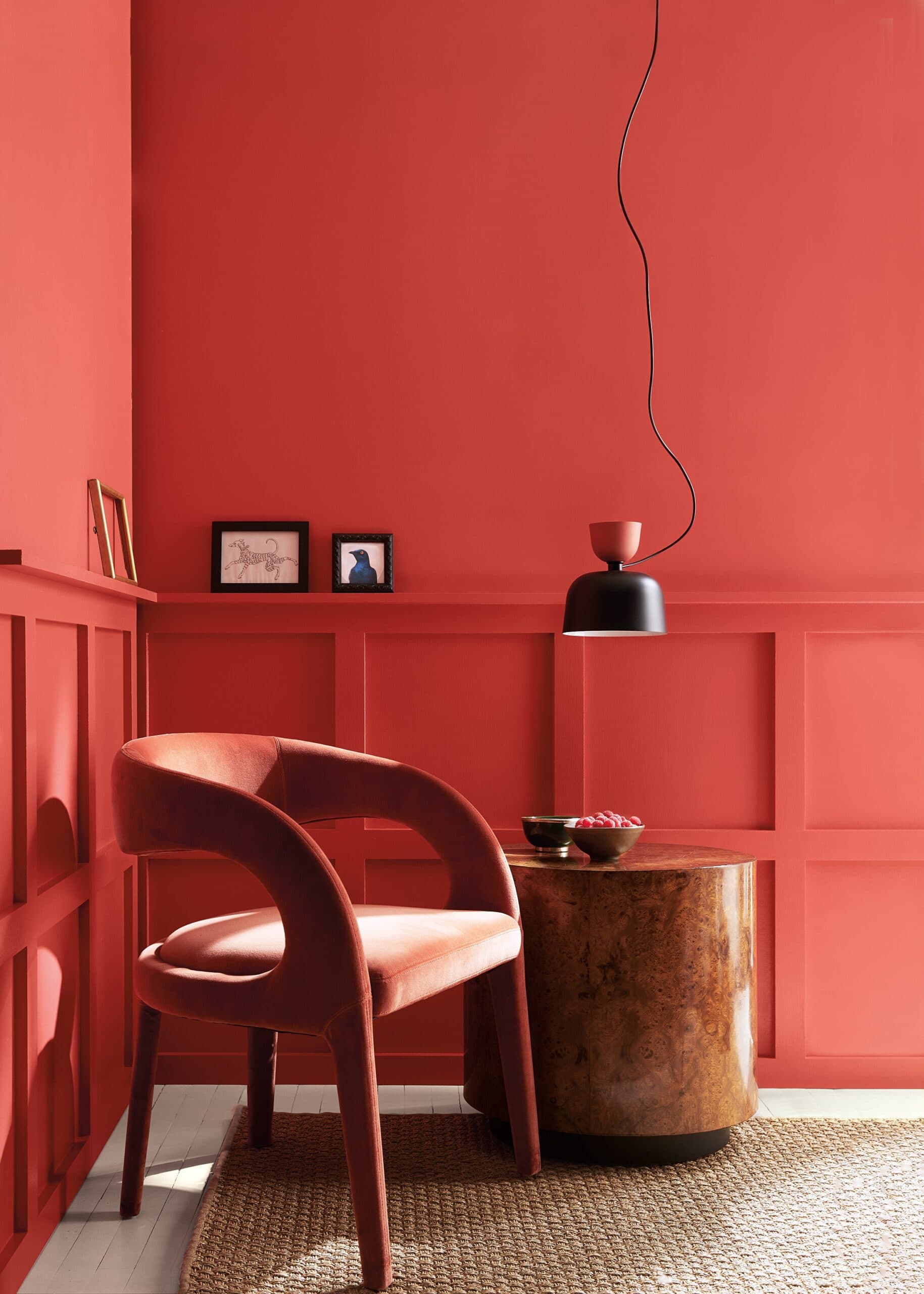
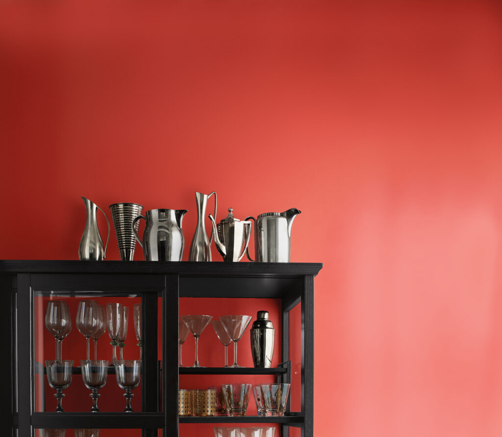
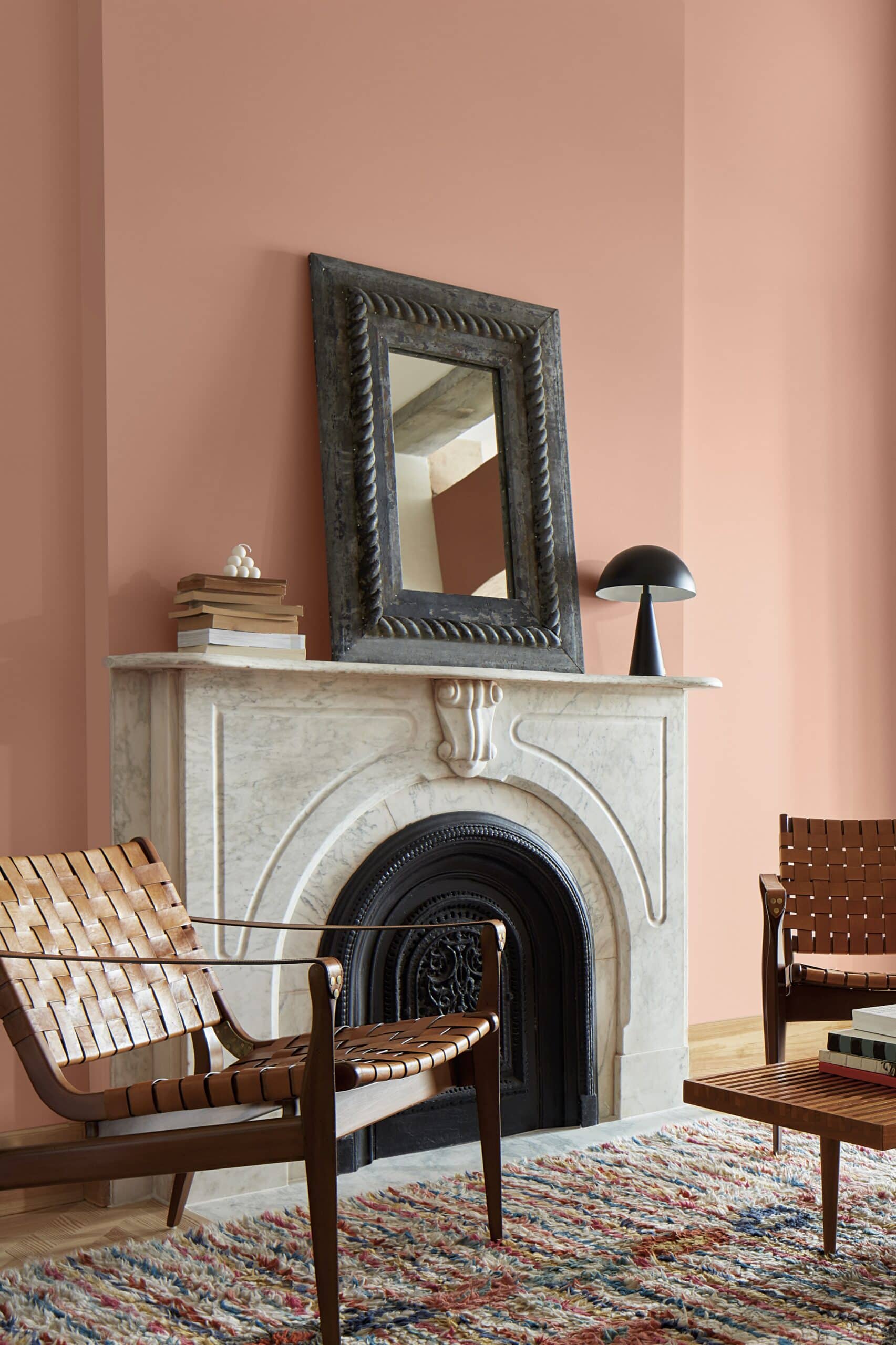
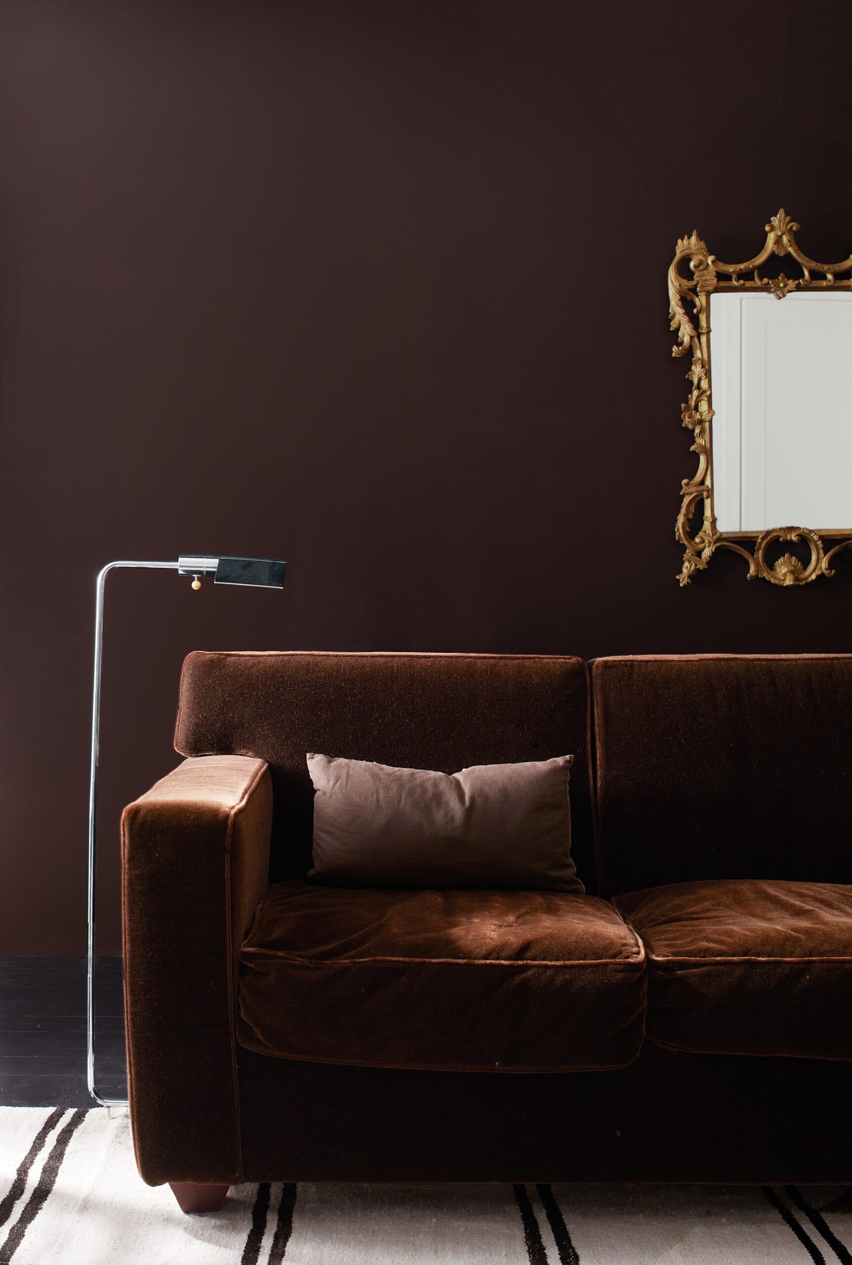
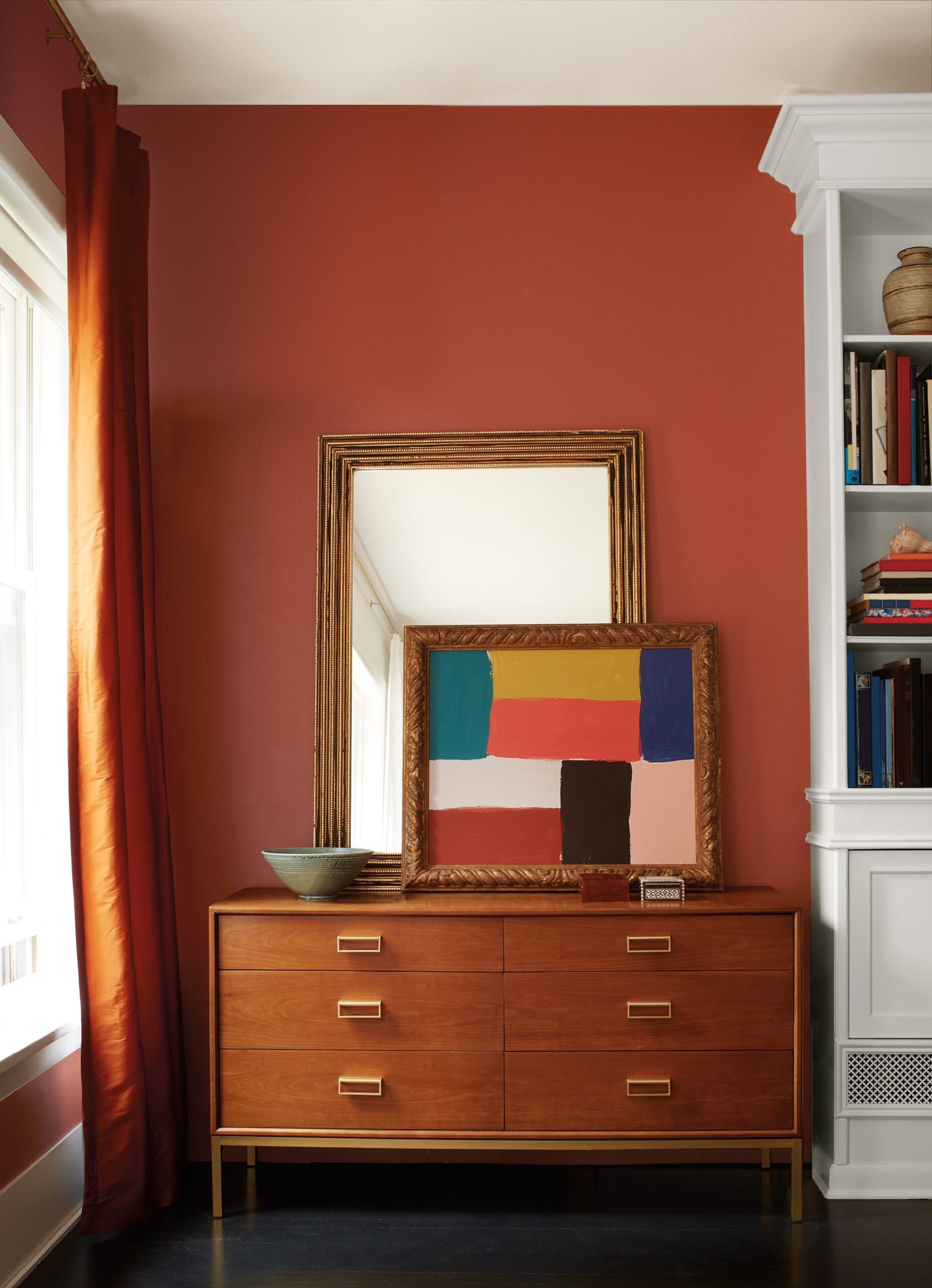
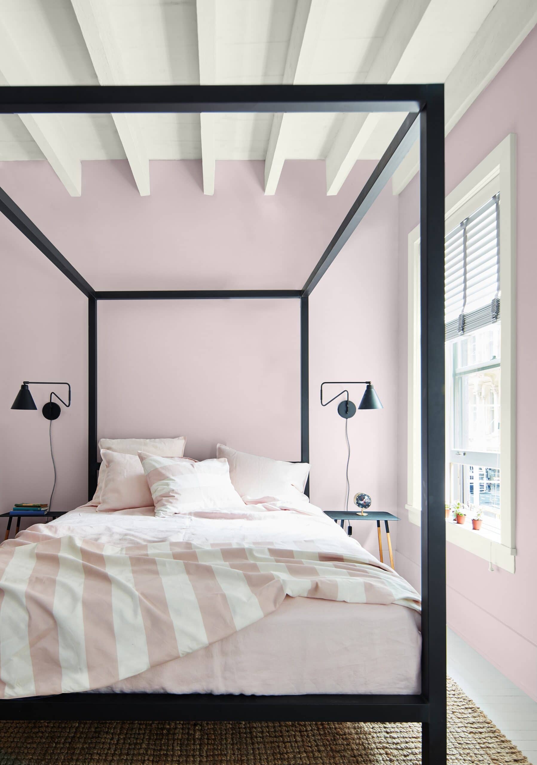
Benjamin Moore is betting that homeowners are ready to bring colour back into their decor, and take a step outside their colour comfort zones. It led the charge with its Colour of the Year Raspberry Blush – a saturated red- orange that exudes confidence, energy, and charm. (See featured pics above and at the end of this post.) It’s just one of one of a rich and nuanced palette of colour tones that, while not for the faint of heart, make definite decor and design statements. For the record, I’m with them on this. And no, that doesn’t mean I can’t also love a terrific neutral.
Such a warm, comforting, livable palette. And while colours are bold, they’re also surprisingly versatile and work well across decor and design styles.
From left to right, by row: Tofino Sunset, Wenge, Cinnamon, Starry Night Blue, North Sea Green, New Age


TAKE NOTE: Electro-funk duo Chromeo created Raspberry Blush, a song to celebrate the positivity and vitality that comes from colour and music. There are also eight curated playlists that reflect the design and decor personality of the colour tones, and capture the spirit of the palette on Spotify.
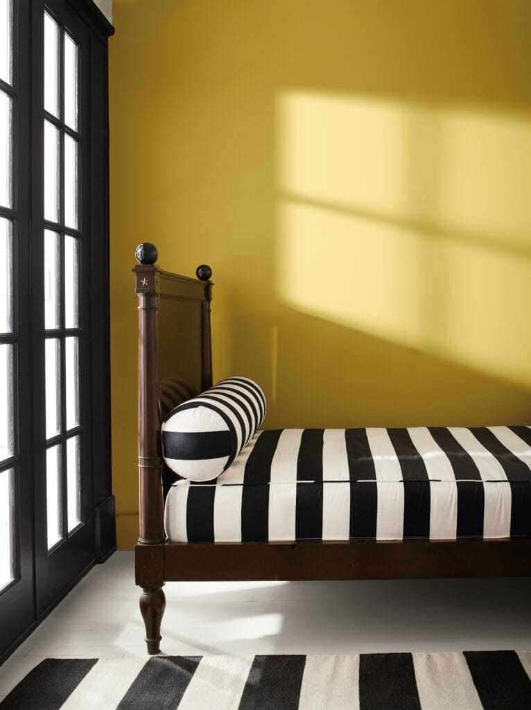
I loved the entire palette but golden ochre tones of Savannah Green (above) particularly stood out for me against these crisp black and white stripes. Check out Benjamin Moore’s Insta feed for more colour inspiration.

