The sale of a pair of apartments in one of the century-old structures that line Chicago’s River North neighbourhood is almost unheard of, especially now that most of those buildings have long been replaced by steel, glass, and iron columns.
But it was just such a rarity that architects at Moss Design were asked to combine into a 2,200 square-foot loft—with 100-year-old original timbers and floors—for a Chicago trader, family therapist, and their toddler. Chicago-based Gil Melott of Studio 6F was given the design task of making it feel like cohesive, communal space.
“It’s hard to make an open space feel intimate, usable, and not cavernous,” he says. “But I think we met those goals.”
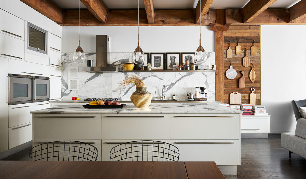
The main floor was carved into dining and living areas, including a library area that functions for work/school, and a crisply contemporary kitchen framed by old timber (below). A wood wall that houses cutting boards also acts as visual divider between kitchen and sitting space.
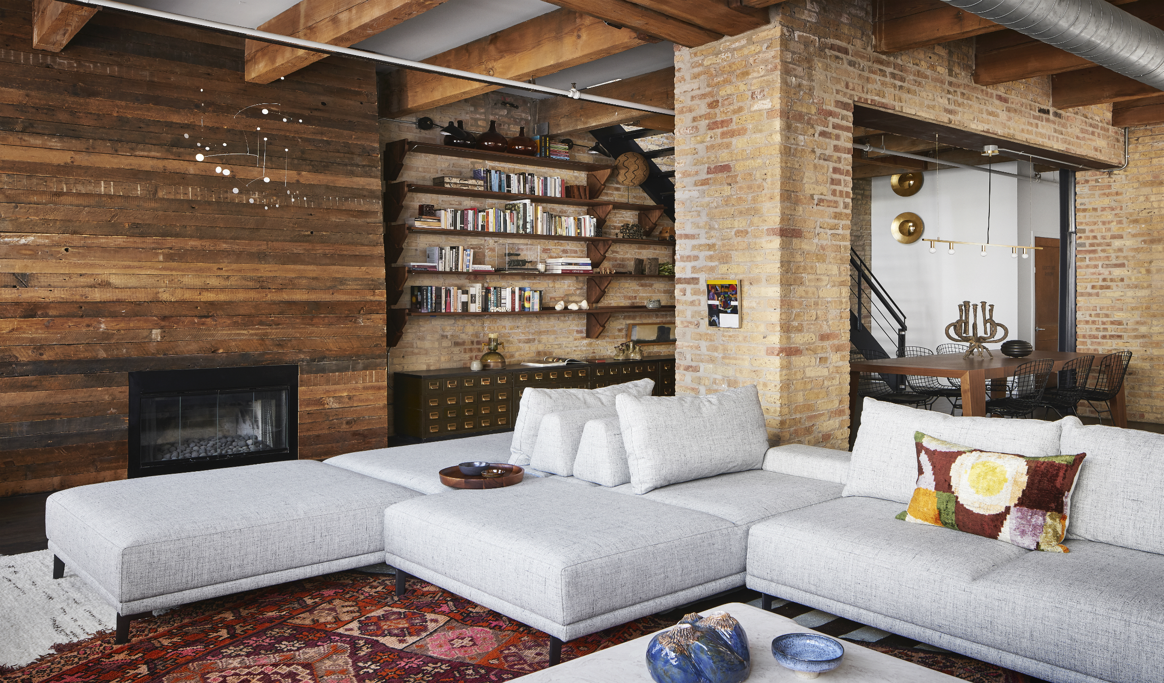
Exposed brick and original timbers and floors establish the character of the space. “It would be sinful and wasteful to cover it, and it goes against the purpose of buying such a place,” says Melott.
Sleek, comfortable, flexible, user-friendly, furniture was also foundational: a sleek sofa from Casa Spazio can be reconfigured. ”It allows conversation to shift,” says Melott.
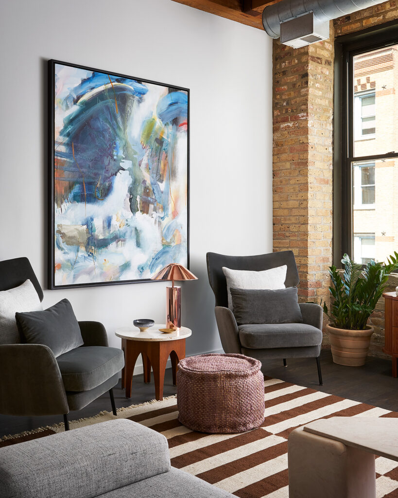
Swivel chairs from American mid-century designer Milo Baughman can either cosily front a fireplace or turn and face a conversation. The palette is inspired by the clients’ love of cooking.
“They wanted colour but not colour in quotation marks,” says Melott, who used burnished spicy shades—nutty, earthy browns, touches of golden yellow, and clay-like red in textiles—often textured—and accessories.
As collectors, the homeowners quickly bonded with Melott, who says his designs typically begin with art. “Some designers start with a rug or a sofa, but I tend to start with art as inspiration—whether or not it’s the art we end up with,” he says. “I want the client to think of art as (an important part of the whole) and not as an afterthought.”
All photos: Ryan McDonald
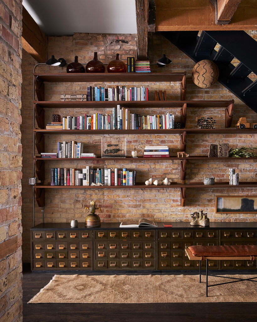
An area that had been a dark space where strollers, toys, and boxes collected was re-purposed as a kid-friendly library/study/activity area. Below bookshelves there’s a credenza fashioned from a 1940’s card catalogue from a U.S. naval academy on Lake Michigan. Now, it’s used for storage and as an exploratory play area, where items can be found by, and hidden for, the child. (Below)
A subtle tension between various elements is deliberate, says Melott, who thinks his frequent moves as a child render him “unapologetic” about bringing disparate design elements together.
“When they come into a new space, people bring the thing that have value to them,” he says. “Whether those things are ‘of the moment’, or of a certain pedigree—that’s irrelevant to me. If it’s beautiful, it’s beautiful.”


