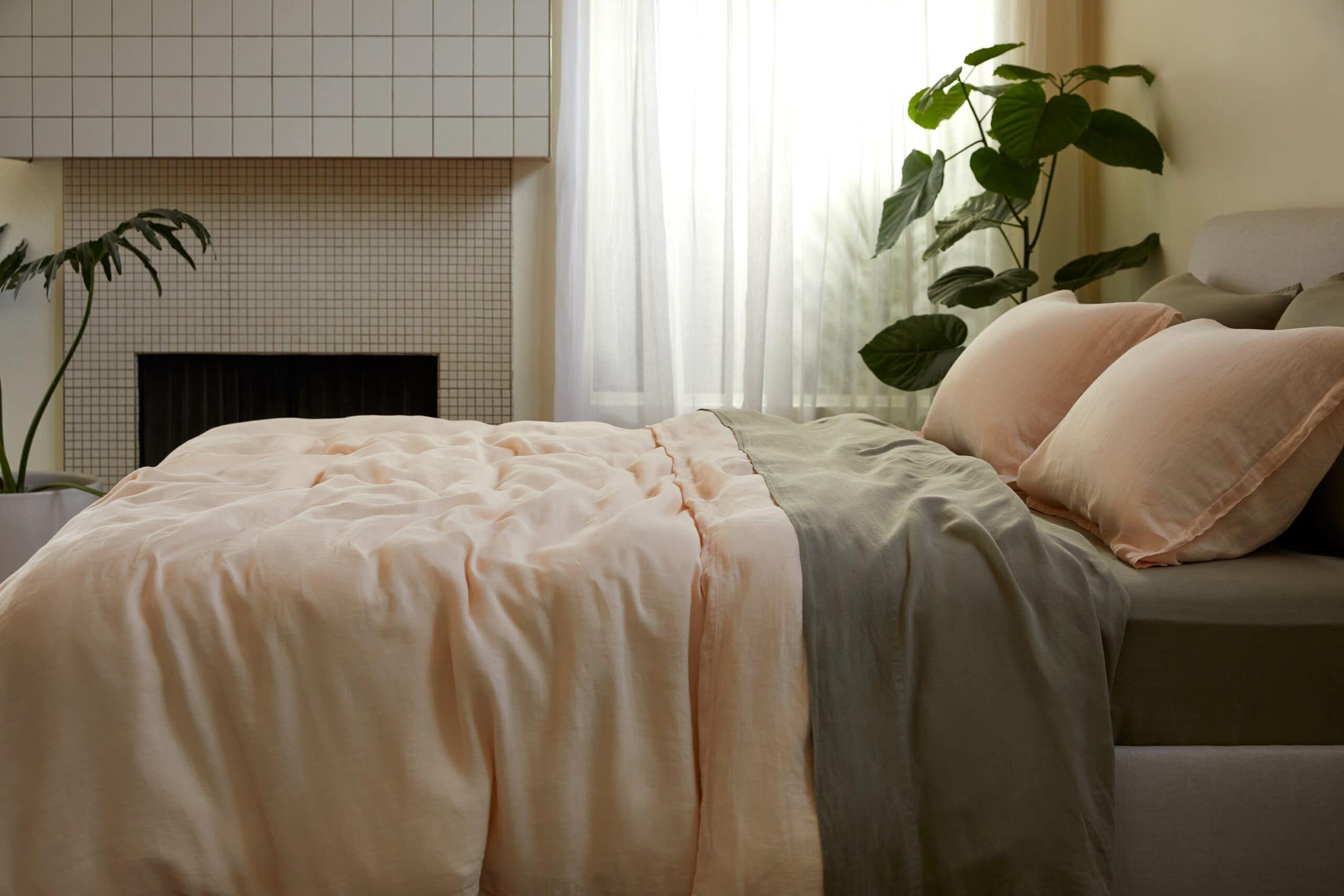
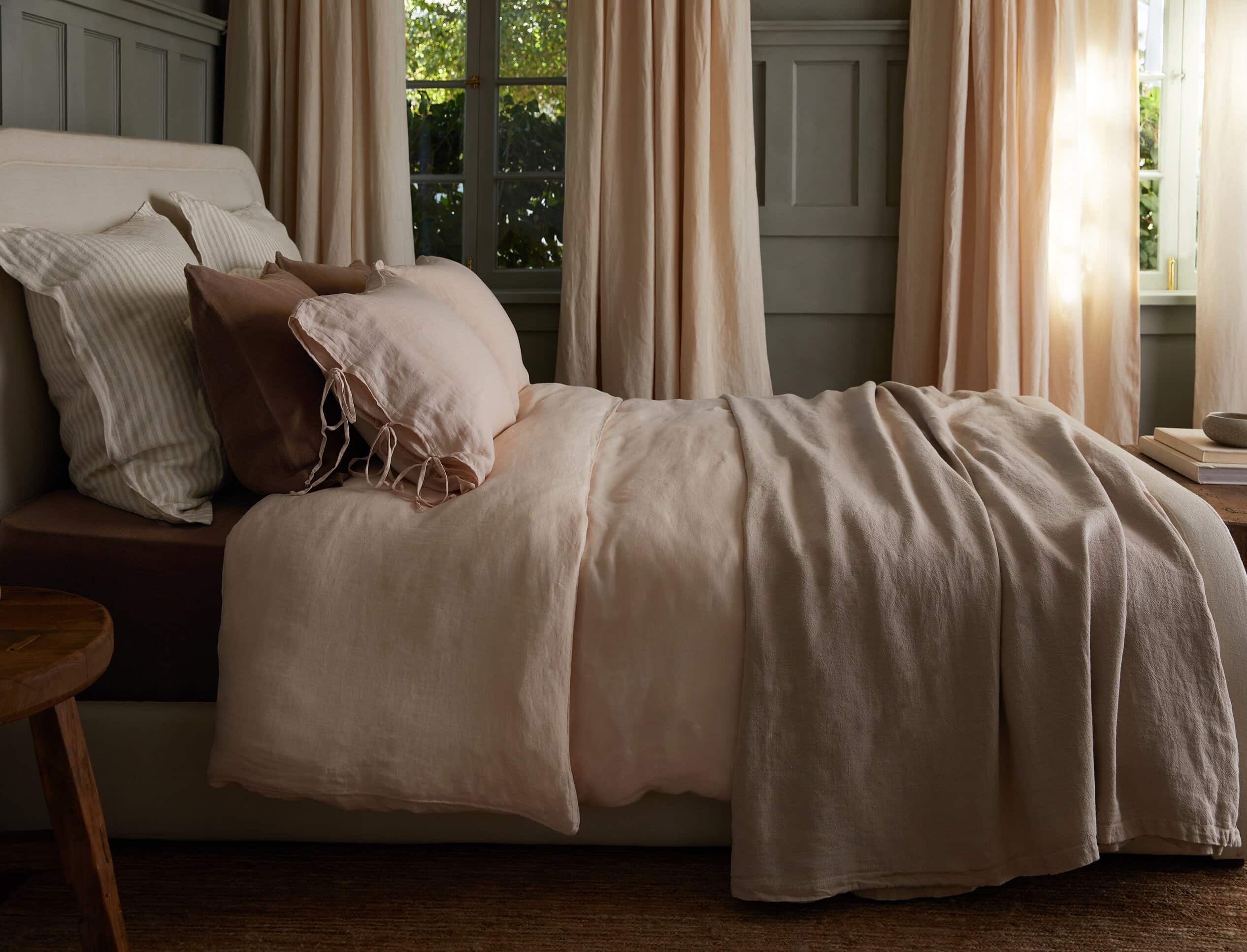
I’m a sucker for bed linens in pastel peaches and peony pinks, especially when they’re paired with café au lait, cream, and clay tones. That makes me a fan of bed linens from Parachute. The California-based brand just launched two new colours, including the delicious Melon shade shown in the sheets below. Melon was a bit of a risk for the brand, says Chief Creative Officer Amy Hoban. “Although it’s a bit father out of our own identity, we wanted to speak to warmer side of the palette with colours that would work with our Terra and Clay,” she says.

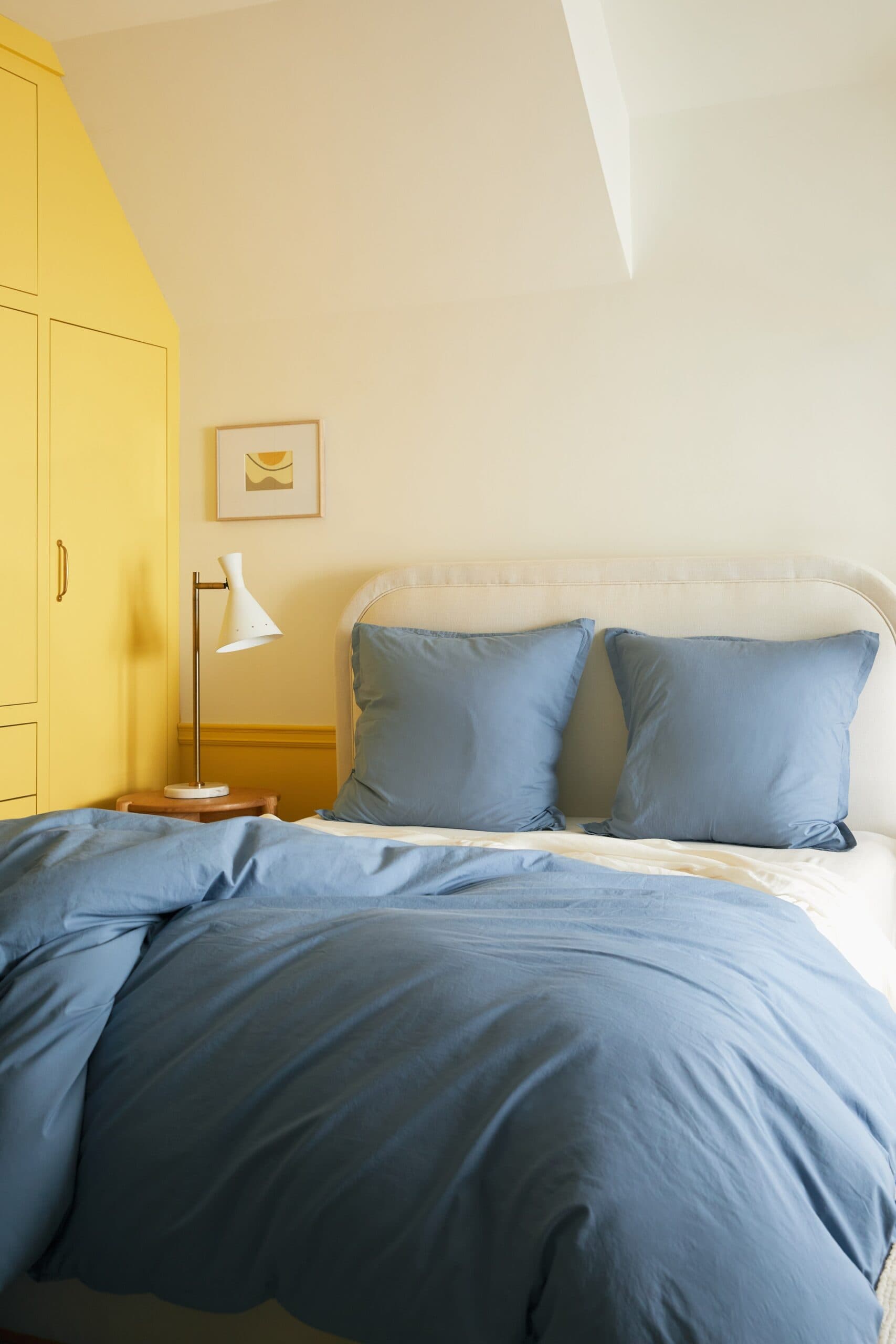
But, wait, I also adore ALL the blues, especially the calming blue of Mist bed linens, shown below. Because this mid-tone blue is such a good anchor, it goes with so many other shades. Certainly, I think it’s particularly fresh with white and yellow.
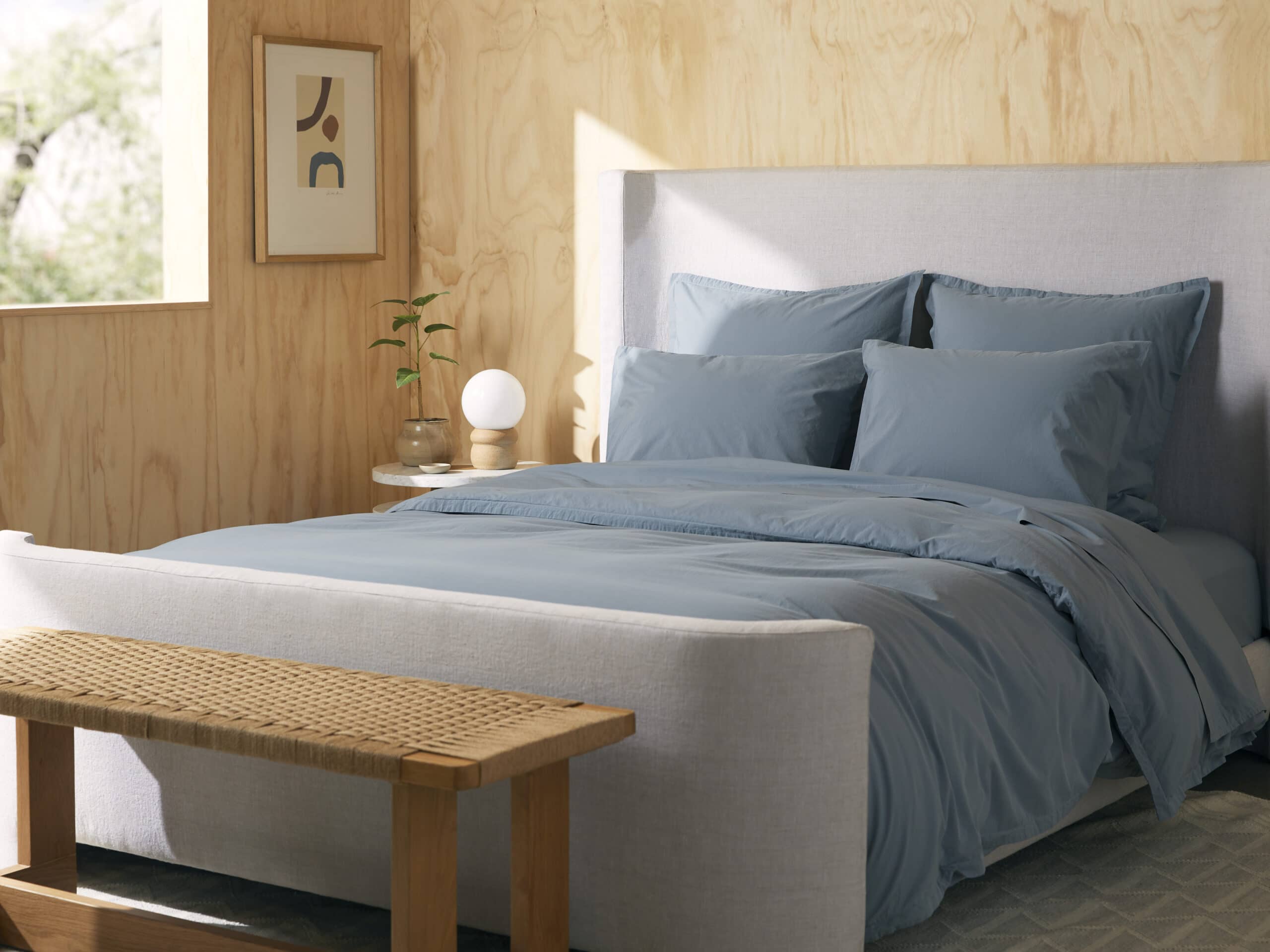

Amy Hoban explains colours influences included post-modernism and the Memphis design movement. Designed with the existing palette in mind, “our Wave was a great introduction on the cool side-and it was already a friend to Dusk, which was a hugely successful colour for us.”
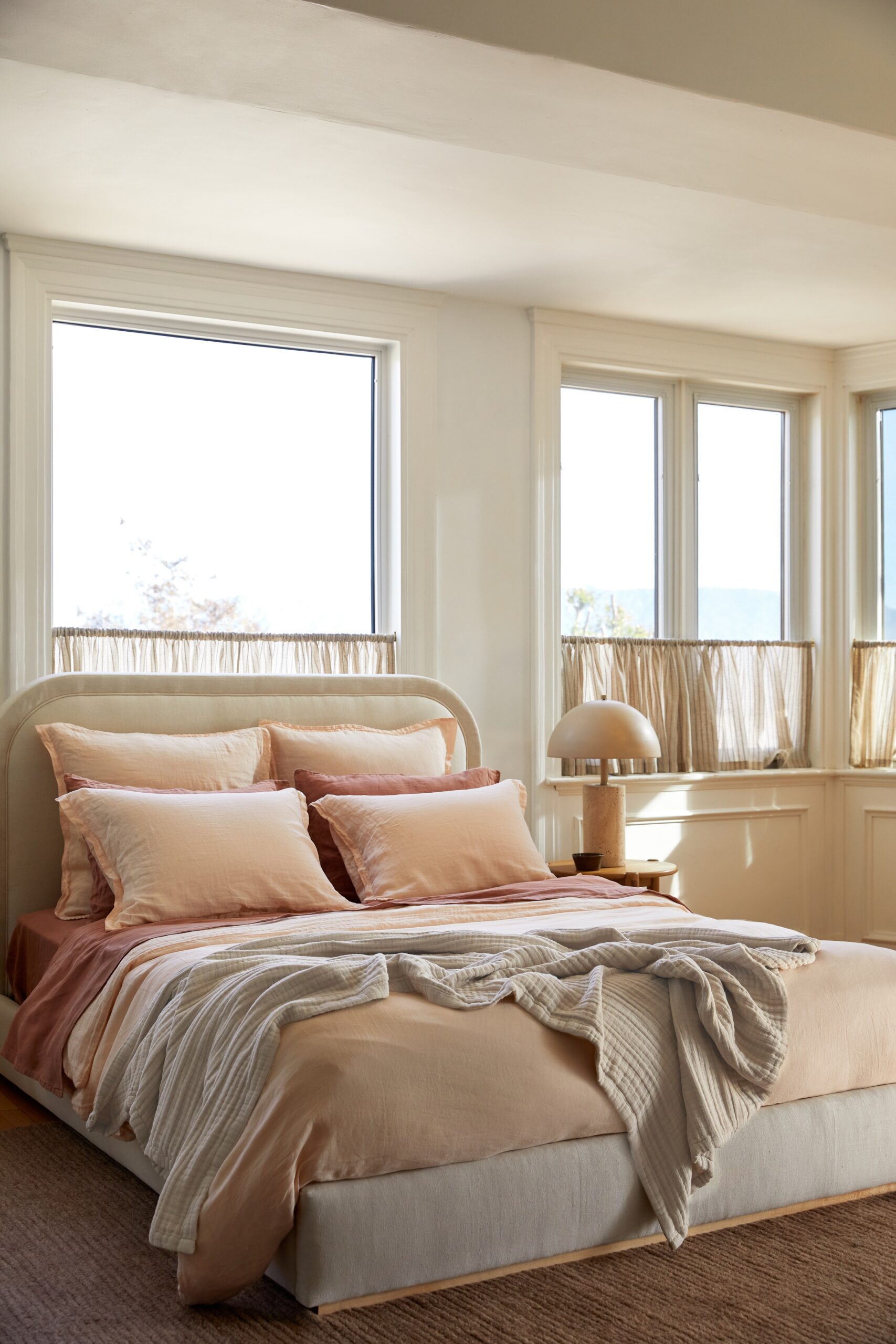
Lastly, I love that these sheets and bed linens can be happily mixed and matched according to mood and weather. It’s hard to pick a favourite among so many options-linen, percale, velvets, in both deeply saturated tones and versatile neutrals like Bone (middle below.)
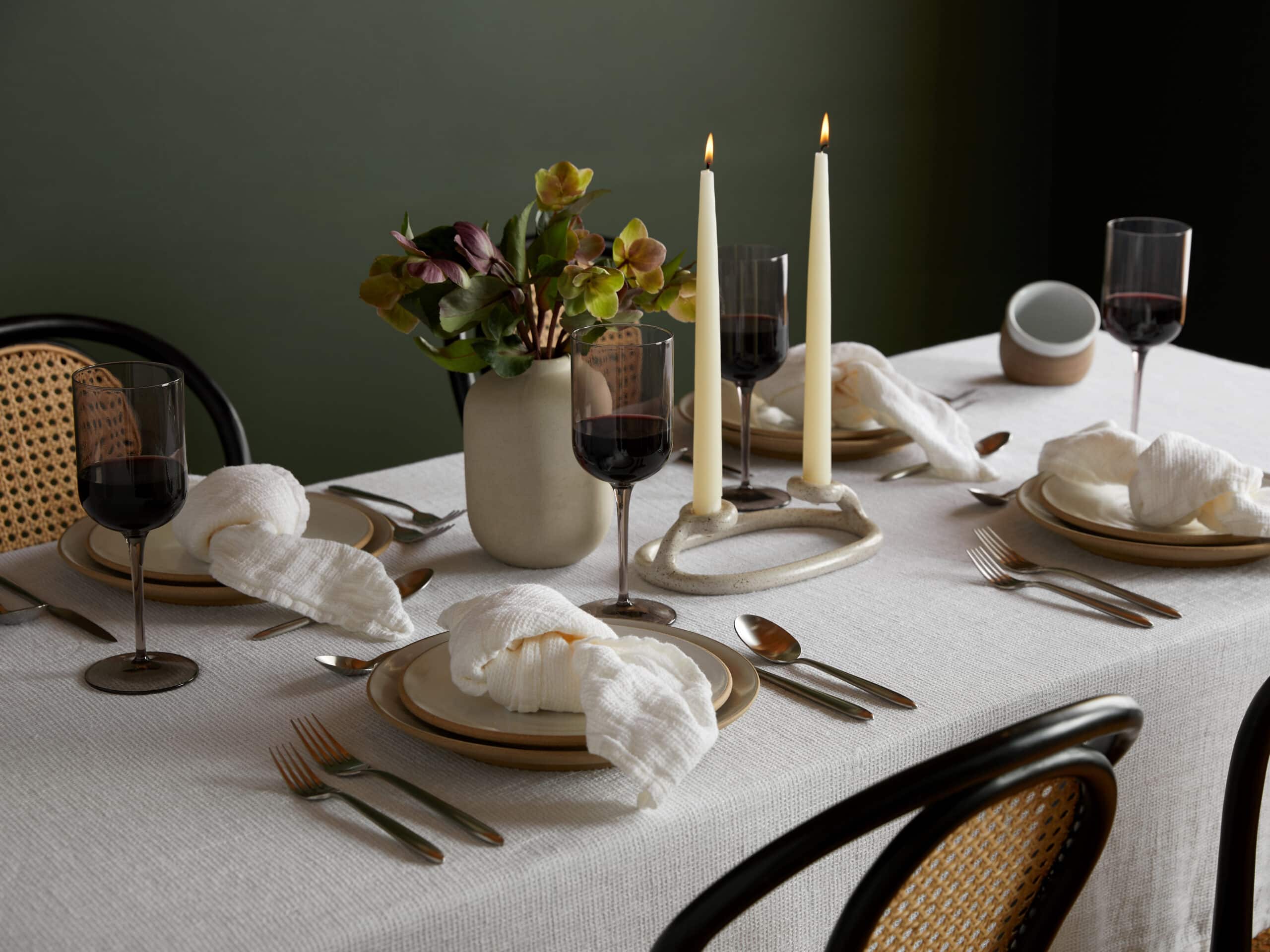
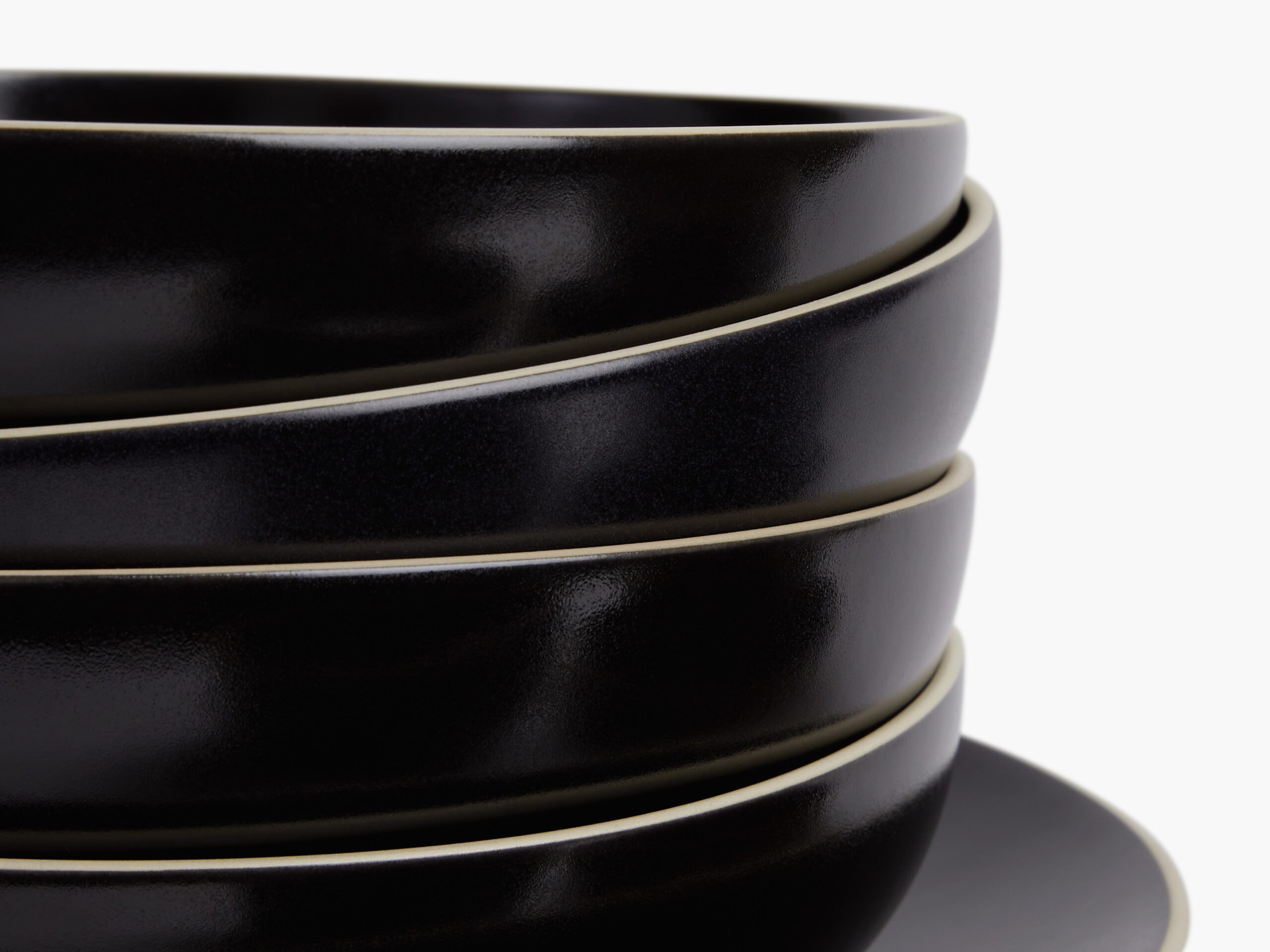
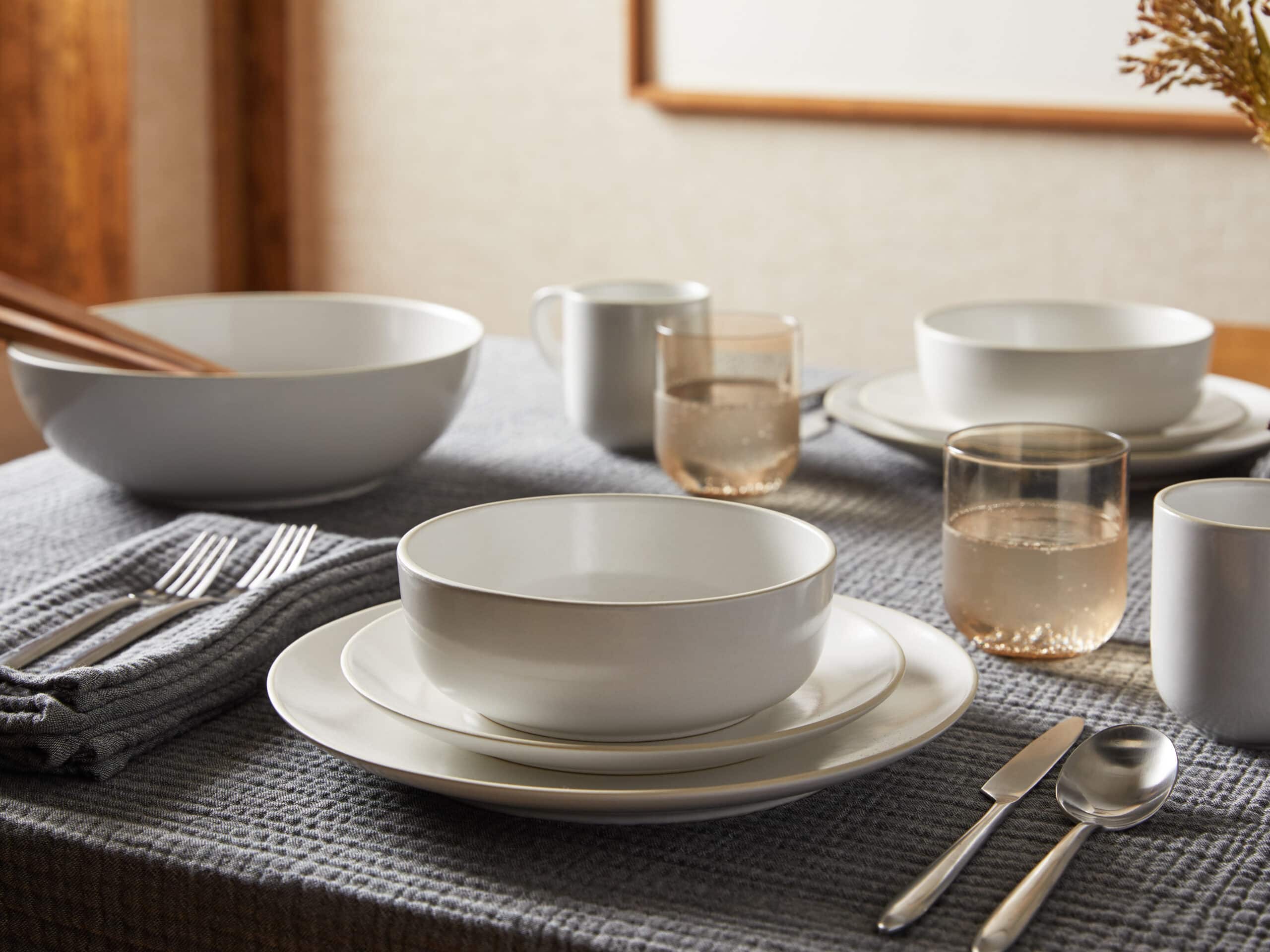
Parachute also has serve-ware and other lines that match their bedding for design and quality. I adore the simplicity of the black and white dish sets below, for example, especially when they are paired with sleek Velo flatware in subtle brushed gold.